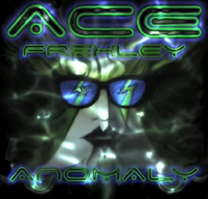
Well, let's just get this out of the way.
It's pretty terrible.
I know Ace has been doing art like this for the last several years, so I'm pretty sure he's the one behind this.
It looks like it's a tweaked version of his 1978 solo album cover, which was totally great, so I guess I can see why he used it as a starting point.
Actually, the art itself is not really THAT bad. OK, the sunglasses are totally cheesy, (and reminiscent of the KISS album cover "Hot in the Shade" which was easily one of their worst) but aside from that it's not the worst thing in the world, it's just not particularly interesting.
The worst thing about it is the effect on the font.
That's what makes it look so amateur, the crappy "chrome" effect that never really works unless you're really good at using it, which is why almost no one should ever use it.
Also, the thing I find very interesting is the fact that Ace can't seem to stress enough how much he wants to get away from KISS and do his own thing, yet this cover has at least 3 fairly obvious KISS references.
1. The 1978 solo album cover
2. The "Hot in the Shade" sunglasses (probably unintentional, but obvious to KISS fans)
3. The upside down lightning bolts over the eyes. Ace has been associated with the lightning bolt symbol before, but when they're upside down, they REALLY look like the S's in the KISS logo.
Now, I haven't heard any of the music yet, hopefully it's better than the cover.
Sorry, Ace. This album cover sucks.
I still think you're awesome though.

…looks like someone got photoshop for Christmas.